04 · Civic-tech concept · 2025
Nadif Malti
A civic reporting app for St Paul's Bay, built so a bag colour and a broken drain need no reading to report.
- Role
- Product design: concept, system, prototype
- Timeline
- 2025–2026
- Scope
- 26 screens across 5 audience segments, design system, coded prototype
- Platform
- Mobile: 390 × 844 prototype
A civic reporting app and collection schedule for St Paul's Bay, designed so a bag colour or a broken drain needs no reading to act on.
Nadif Malti is a concept. There's no council contract behind it, and it isn't a live product for St Paul's Bay. It's a self-directed exercise in a real constraint: Malta's colour-coded bag system and its street-level problems (illegal dumping, blocked drains, rats) are exactly the kind of civic task that breaks down when the interface assumes everyone reads the same language fluently.
One app, two things residents actually need
The product does two jobs: tell a resident which bag goes out and when, and give them a fast, structured way to report a street problem instead of a phone call or a Facebook post that goes nowhere.
The prototype is coded, React, 390 × 844, and every screen on this page is a capture of it: onboarding, home, the five-step report flow, the weekly schedule, report history and settings.
A council-facing operations view was designed alongside it (in the source material) but was never built as working software. It's noted here as a designed surface, not demonstrated as one. This case study only shows what actually runs.
- Type
- Self-directed concept: no council client
- Platform
- Mobile (390 × 844 prototype)
- Screens
- 26 across 5 audience segments
- Languages
- English + Malti onboarding choice
Four tabs, one report button always in reach
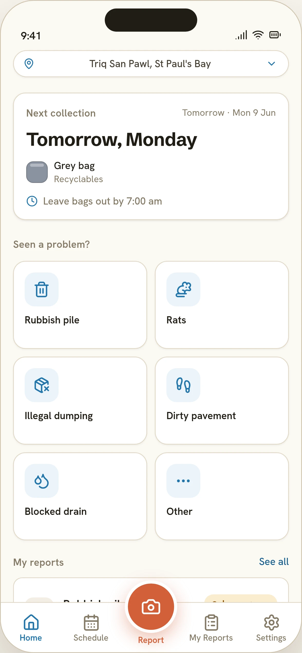
Home, Schedule, My Reports and Settings sit in the tab bar. The Report FAB floats above it on every tab screen: reporting a problem is never more than one tap away, and it's the only action styled in the terracotta accent colour.
- Home
- Address chip · next-collection card
- Six-category quick-report grid
- Recent reports
- Schedule
- Seven-day strip, colour per bag
- Day detail → what to include / exclude
- My Reports
- All · Open · In progress · Resolved
- Report detail → status timeline + council note
- Settings
- Language · Notifications · Appearance
- My address · Council zone
- Anonymous reporting
- Report (FAB)
- Category → Photo → Location → Details → Review → Confirmed
Five steps, no account
A report in under a minute
- 01 / 06
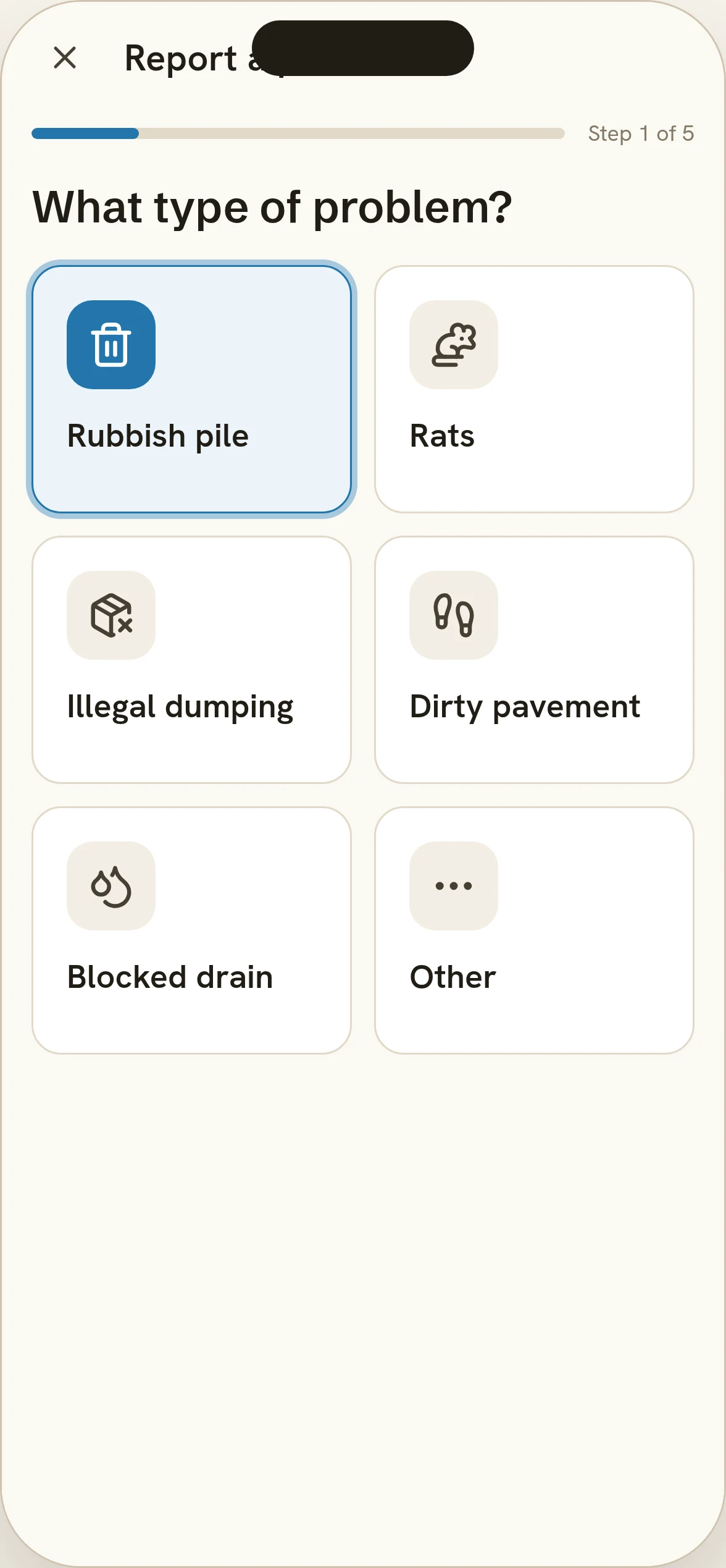
Tap a category, the flow advances itself
Six categories, each with an icon before its label. Tapping one both selects it and moves to the next step: there's no separate "continue" tap for step one.
Category: the tap is the advance. - 02 / 06
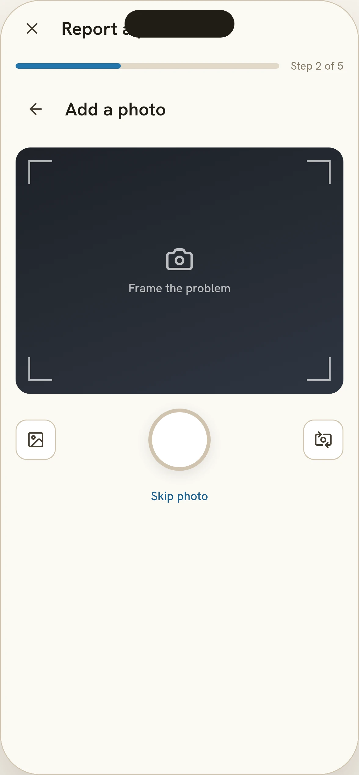
Camera first
The shutter sits at natural thumb reach, full-screen, before any form field appears. A photo is the primary evidence a council report needs.
Photo: nothing to type yet. - 03 / 06
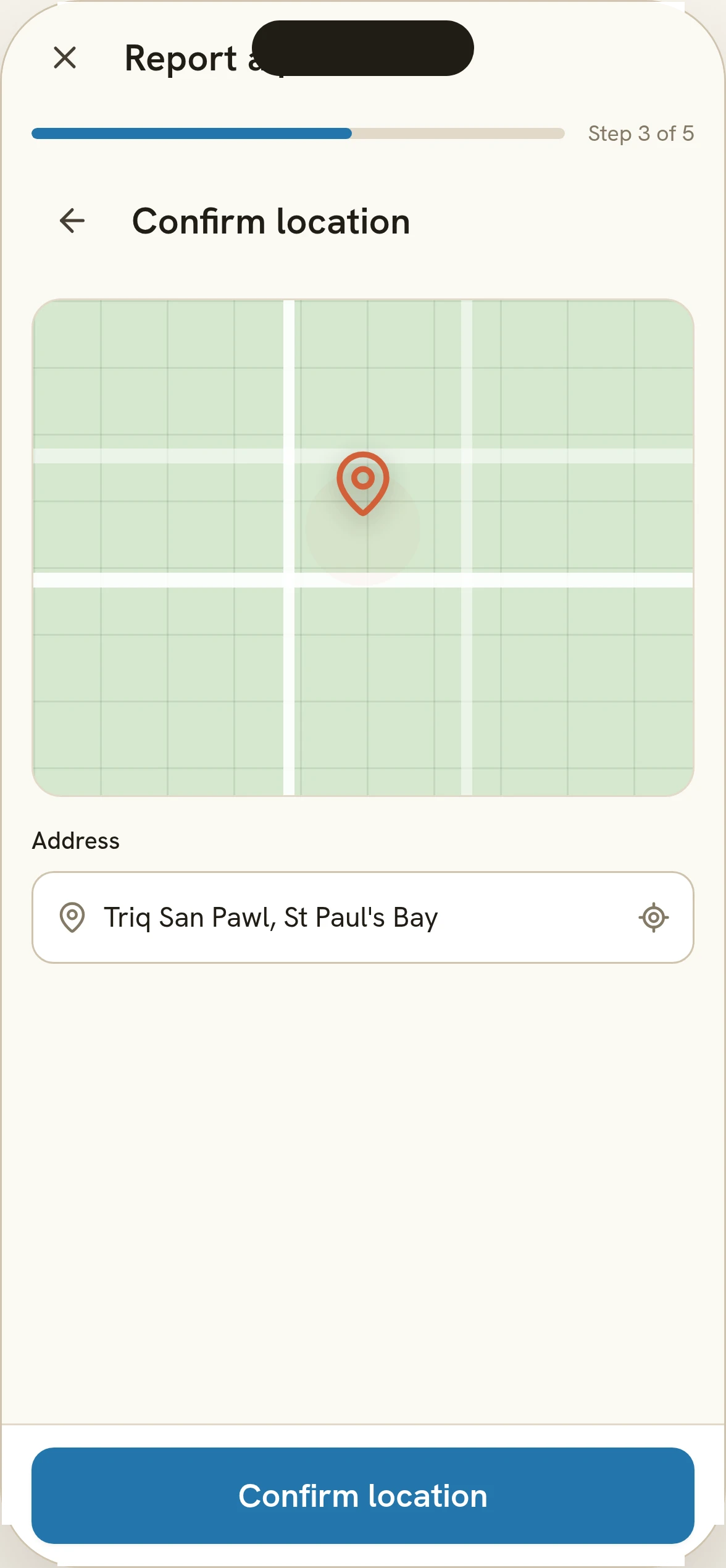
Location pre-fills, dragging corrects it
The pin starts on the device's location, and the address line updates as it's dragged. "Confirm location" is the only action needed if the pin is already right.
Location: GPS first, a drag if it's wrong. - 04 / 06
Anonymous by default, everything else optional
The description and the email field are both marked optional. Anonymous reporting is switched on before the resident ever sees the toggle: they'd have to turn it off, not on.
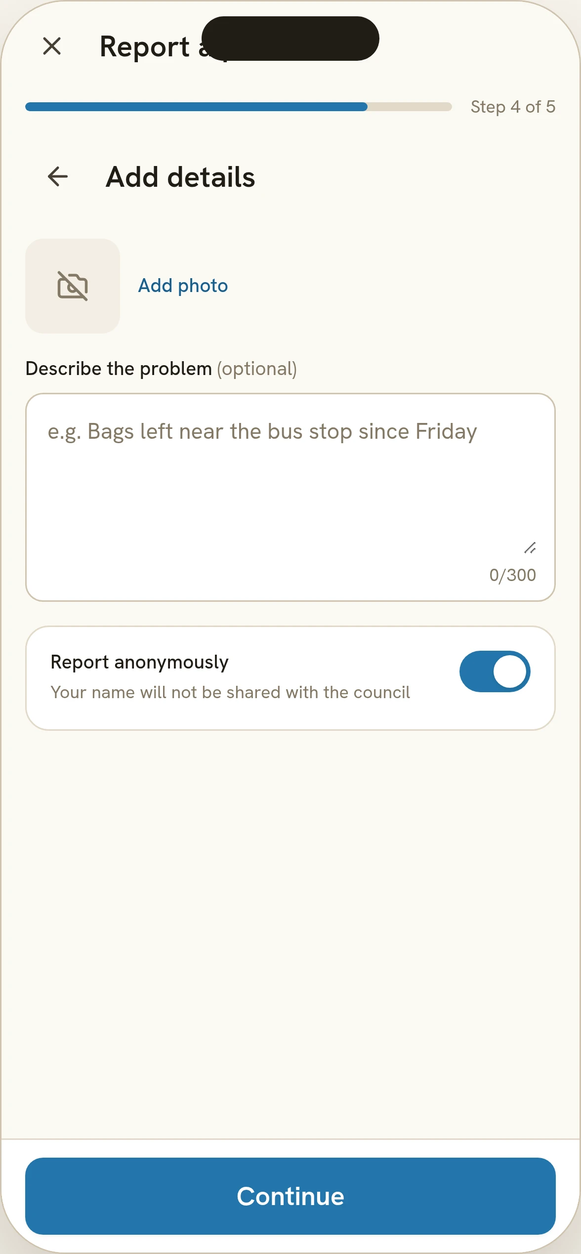
Details: opting in to be identified, not out. - 05 / 06
Review before it's sent
Every field from the previous four steps, each with its own "Edit" back to that step, so fixing the location doesn't mean redoing the photo.
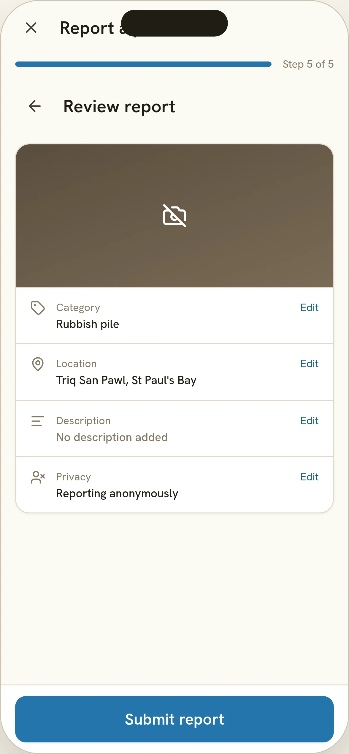
Review: edit any field without restarting. - 06 / 06
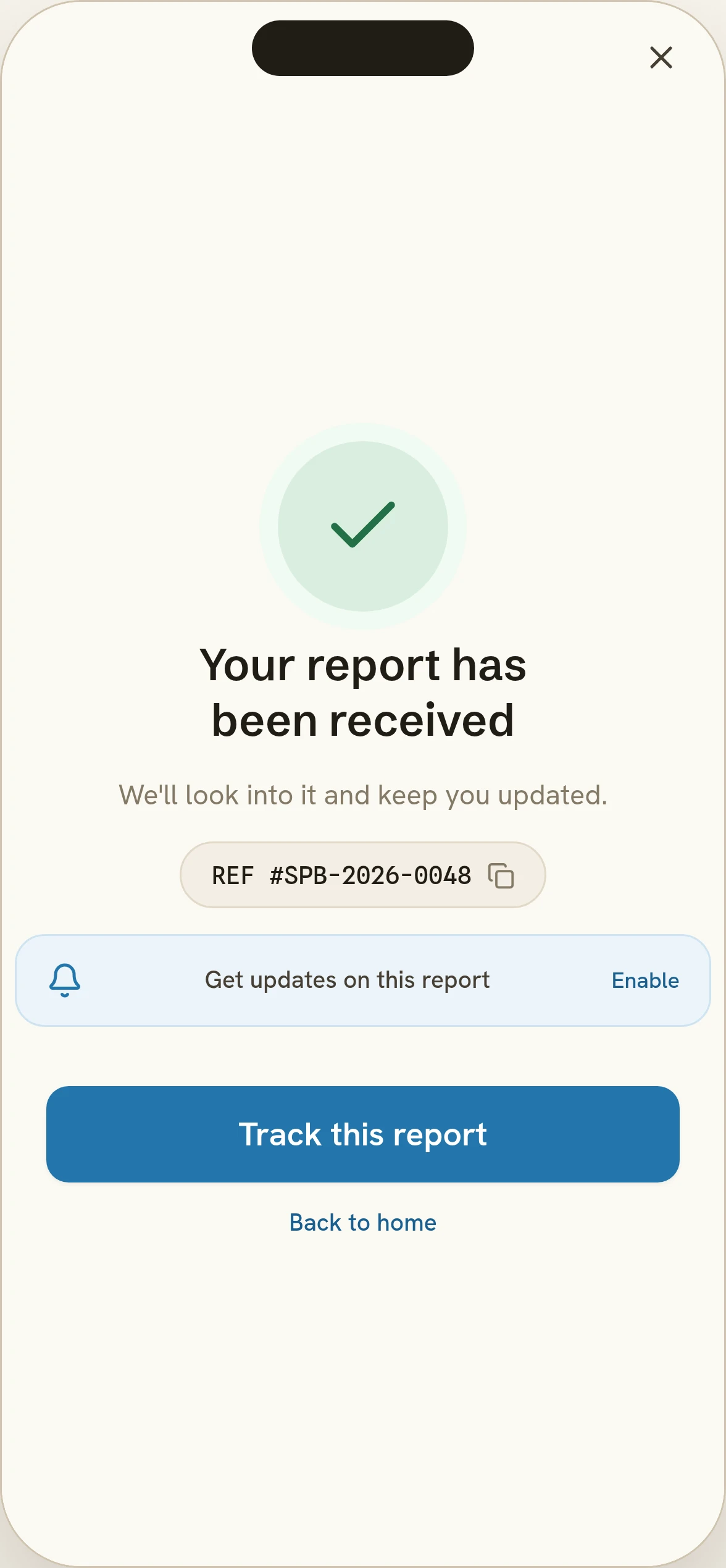
A reference, not just a thank-you
The confirmation gives a reference number and a direct route to tracking, so "I reported it" has something to point to later.
Confirmed: a reference number, not a dead end.
The other half: knowing before you have to ask
Schedule and My Reports are the app's quiet screens: no flow to complete, just an answer on arrival. The day strip colour-codes the week. A report's detail closes the loop with a status timeline and, where the council has one, a note.
- 01
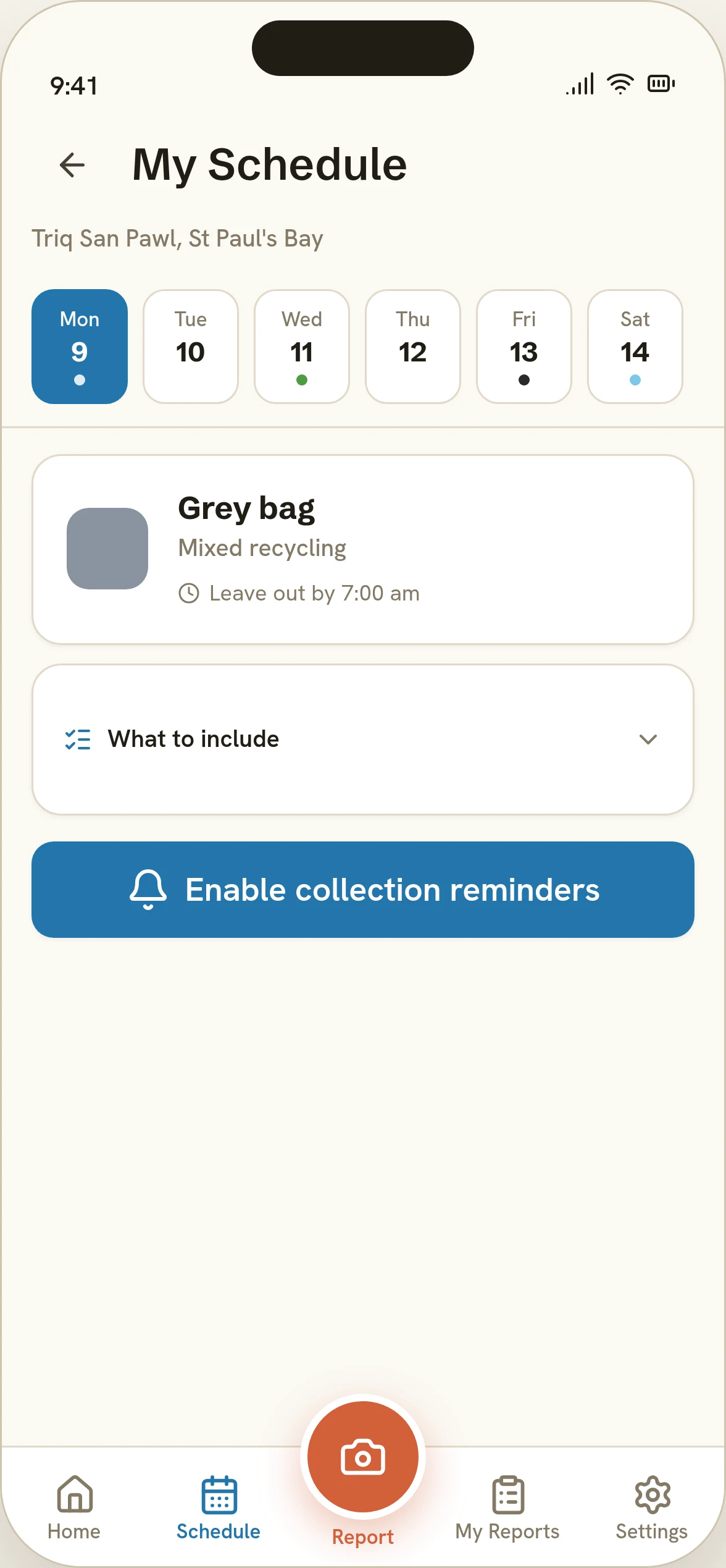
Schedule: colour first, text second. - 02
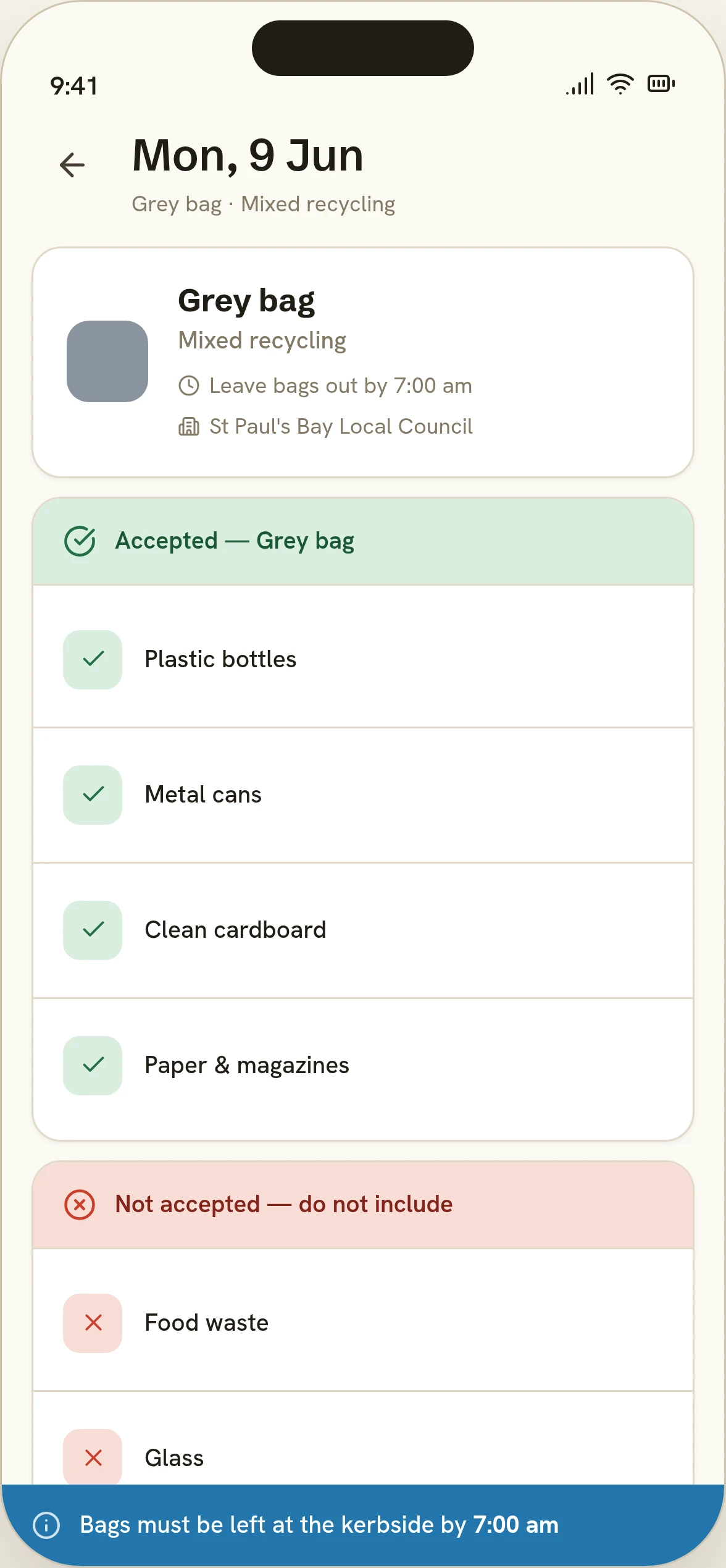
Day detail: accepted and not-accepted, not one merged list. - 03
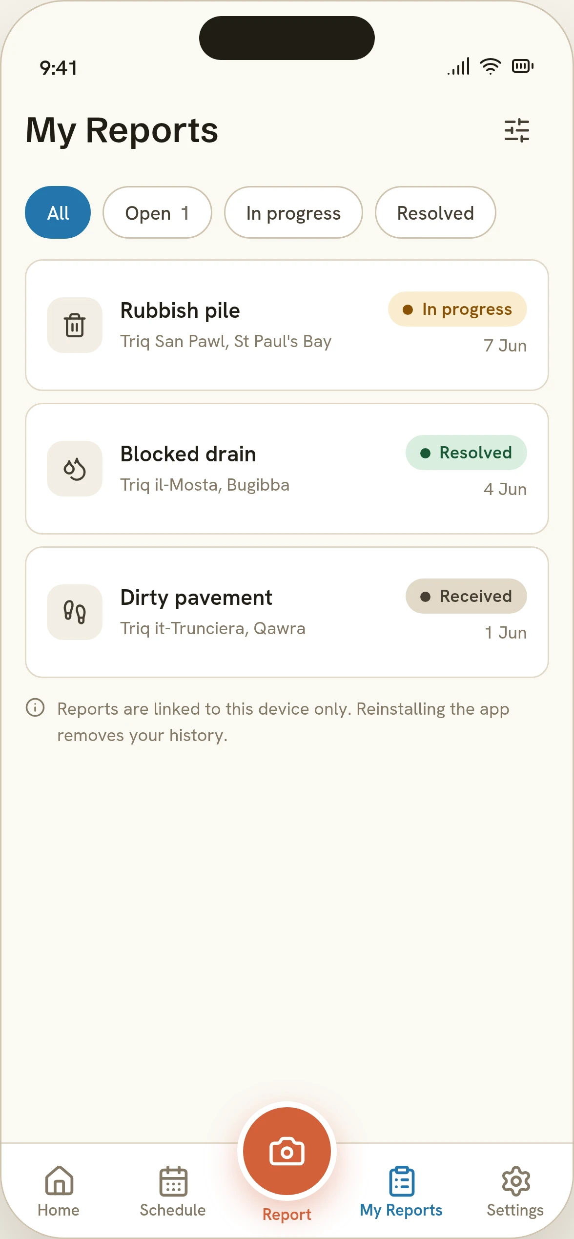
My Reports: status is the first thing you read, not the last. - 04
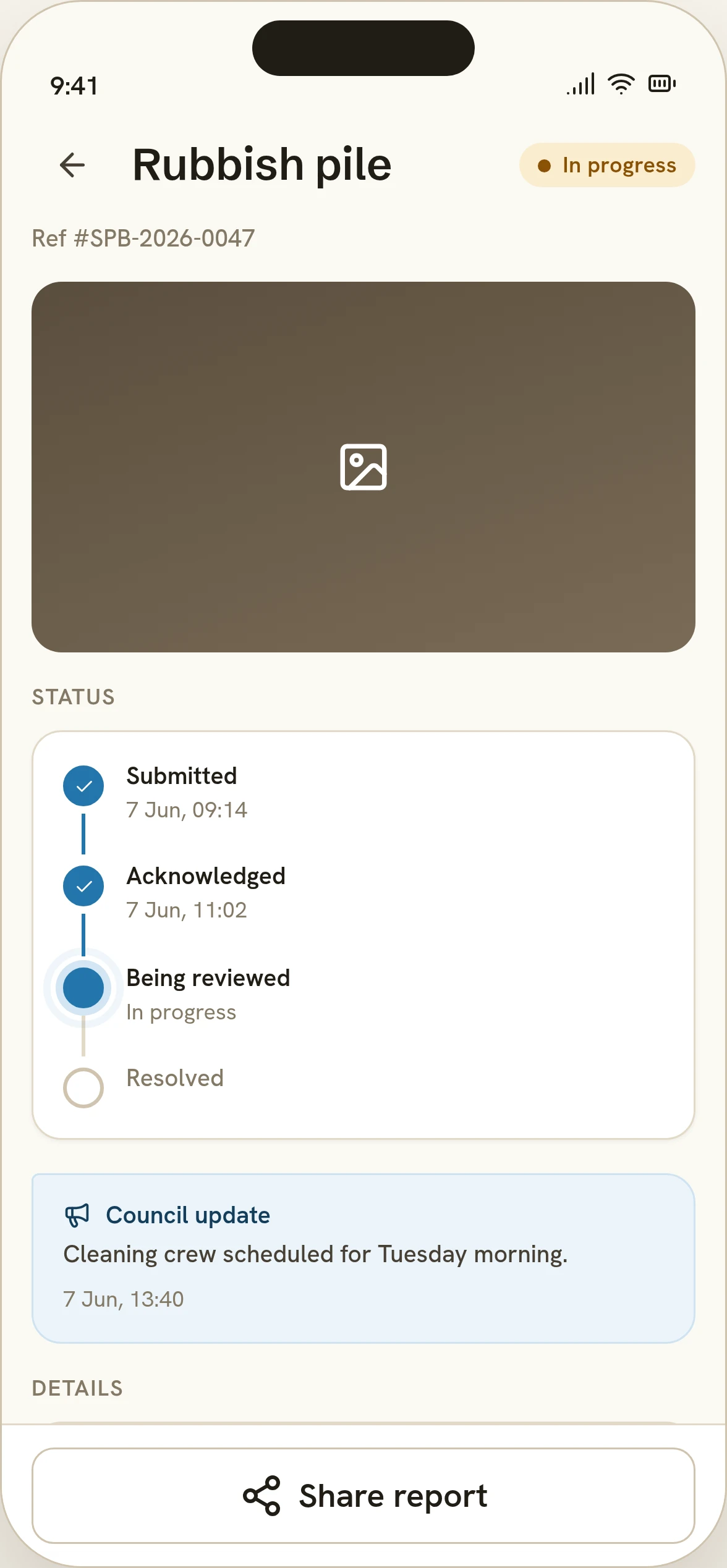
Report detail: the timeline residents never had before.
Where the constraints actually bit
- Decision 01
- Constraint
- St Paul's Bay has a meaningful non-Maltese-speaking population, and a UI that leans on reading, in either language, excludes exactly the residents most likely to get the bag schedule wrong.
- Decision
- Lead every category, status and schedule day with an icon before its label, and offer an English/Malti choice at onboarding rather than assuming one.
- Result
- The quick-report grid, the bag-colour dots and the status badges all read at a glance before the text does.
Home: colour and icon carry the meaning first. - Decision 02
- Constraint
- An account wall on a civic-reporting flow suppresses exactly the reports a council needs most, from residents who won't sign up to report a rat.
- Decision
- Make anonymous reporting the default, not an option to find. Tracking still works without an account, tied to the report's own reference number.
- Result
- The details step shows the toggle already on, and the confirmation hands back a reference ("SPB-2026-0048") the resident can track without ever registering.
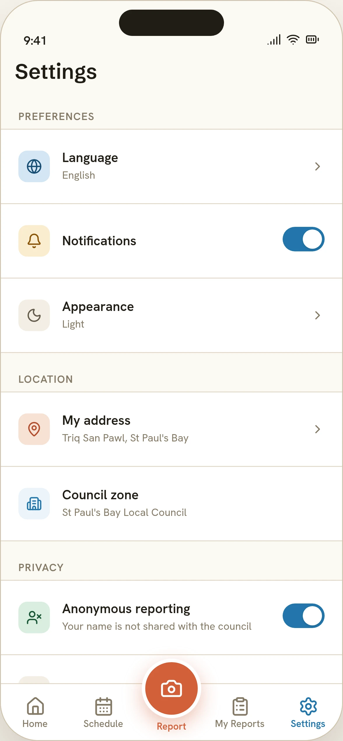
Settings: the default is stated, not hidden. - Decision 03
- Constraint
- "We'll look into it" with no further word is why residents stop reporting problems at all.
- Decision
- Give every report a four-stage timeline (submitted, acknowledged, being reviewed, resolved) with room for a council note attached to a specific update.
- Result
- A resolved report shows exactly when each stage happened and what the council said, not just a final "done".
The loop residents could never see before now closes on-screen.
A civic palette, and type that can spell the street names
Sea blue for the brand and navigation, terracotta reserved for the one action that matters (Report), warm limestone neutrals instead of pure white or black. Hanken Grotesk was picked specifically because it covers the Latin-Extended glyphs Maltese needs (ċ, ġ, ħ, ż) alongside Schibsted Grotesk for headings and Spline Sans Mono for reference numbers.
- Sea 500: brand#2376AB
- Sea 700#164D73
- Terracotta 500: accent, Report FAB#D2603A
- Stone 50: app background#FBF9F4
- Stone 900: text#211D16
- Amber: in progress#D98A12
- Green: resolved#2F8F5B
- Headings: Schibsted Grotesk700 · 24–38px
- Body & UI: Hanken Grotesk400–600 · 13–16px
- Reference numbers: Spline Sans Mono500 · 13px
Try it
The real prototype on sample data, served as supplied rather than rebuilt. Report a problem, check the schedule, browse My Reports. There's no account and nothing is sent anywhere. Every report and address is sample content.
Loads on request. Nothing is embedded until you start it.
What it is, and what it isn't
Nadif Malti is a portfolio concept: a working citizen app of 26 screens with a real report flow and schedule, and no council, no users, no launch behind it. There are no results to report, only the product to check for yourself.
- A working five-step report flow with a real category grid, camera step, location pin and review-before-send
- A seven-day, colour-coded collection schedule with per-day accepted/not-accepted lists
- A council operations view was designed alongside this but was never built as interactive software: it's a designed surface, not a demonstrated one
Reflection
The screen that actually needed the most thought wasn't the report flow, it was Settings: making "your name is not shared with the council" sit next to the toggle, already on, rather than hoping a privacy policy somewhere covered it.
The bigger lesson was about honesty in a concept project: it's easy to draw a council dashboard with plausible KPI numbers on it, much harder to resist including it as if it were real software. It isn't here, on purpose.