05 · Wellness concept · 2025
Sahaja
A practice companion built around showing up, not streaks, and a teacher marketplace held back until it's ready to ship.
- Role
- Product design: concept, system, prototype
- Timeline
- 2025–2026
- Scope
- 13 practices, 3 journeys, a full practice player, a feature-flagged marketplace
- Platform
- Mobile: 390 × 844 prototype
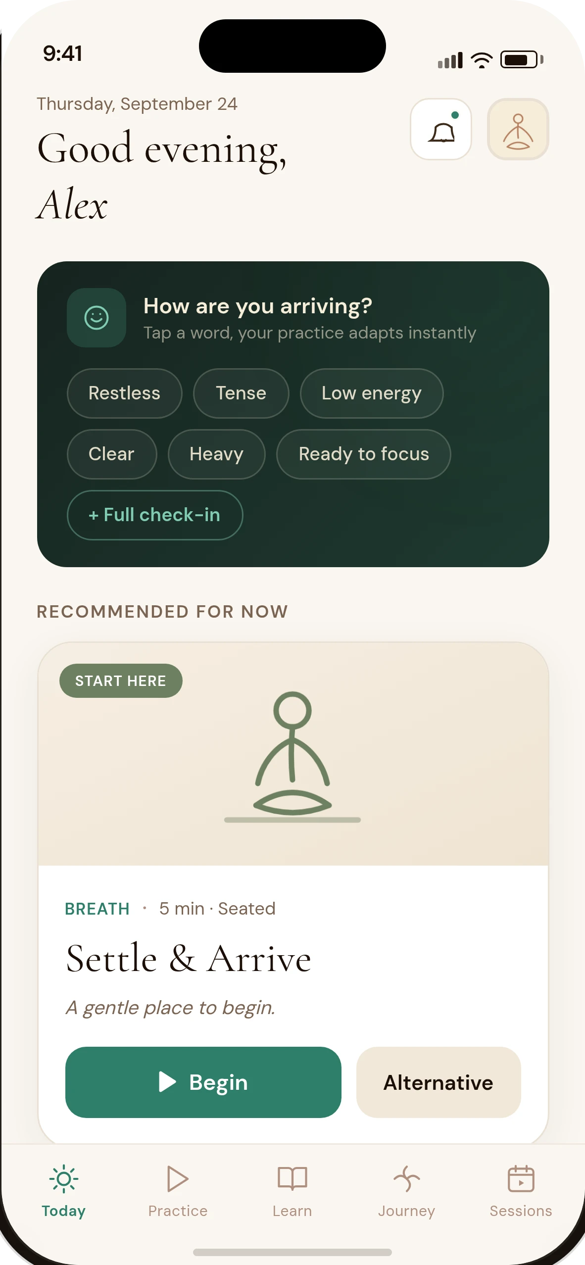
A self-guided practice companion, built around showing up rather than streaks, and a two-sided marketplace designed in full but held back from daily use.
Sahaja is a concept, not a shipped product. There's no company, no live backend, no real instructors behind it. What's real is the app: a working practice library with a player, three guided journeys, and a teacher-session marketplace that's fully built but deliberately kept out of the main experience until it earns its place there.
A library, not a video feed
The core of Sahaja is 13 structured practices across body, breath and mind, plus short one-minute resets for a busy moment. Every practice carries the same shape: what it offers, how to set up, numbered steps, a breath cue, alignment points, common mistakes, modifications and a caution list, not just a title and a play button.
The prototype is coded and interactive: browse the library, open a practice, read the full instruction, and run it in a real player with a countdown and step progression. Every screen on this page is a capture of it.
Sessions with a live teacher exist as a complete, working flow, booking, payment, a teacher-side dashboard, even a moderation screen, sitting behind a single toggle labelled "a future release" so it never competes with the daily practice for attention.
- Type
- Self-directed concept: no company, no backend
- Platform
- Mobile (390 × 844 prototype)
- Library
- 13 practices, 3 guided journeys
- Marketplace
- Fully built, off by default
Five tabs, one of them not turned on yet
Today, Practice, Learn, Journey and Sessions sit in the tab bar. The first four carry the daily product. Sessions is the marketplace entry point, present in the navigation but empty of promotion until a resident toggles it on from Settings.
- Today
- Check-in → adapts the recommendation
- Recommended practice → Begin
- Practice
- Filter by domain, time, position, safety
- Collections: Start Here, Morning, Wind Down
- Journey
- Practice Petals (weekly, no streak)
- Guided journeys → day-by-day detail
- Sessions (preview, off by default)
- Discover teachers → book → pay → confirm
- Teacher side: apply, dashboard, payouts
- Profile
- Saved · Reminders · Safety profile
- "Teacher Sessions: a future release" toggle
From browsing to breathing
A practice you can actually follow
- 01 / 03
The library reads like a menu, not a grid of thumbnails
Domain filters (Body, Breath, Mind, Life), a length and position filter, and a safety-level filter sit above the list. Each card states its level plainly, Start Here, Foundation, or Practice with care, before you tap it.
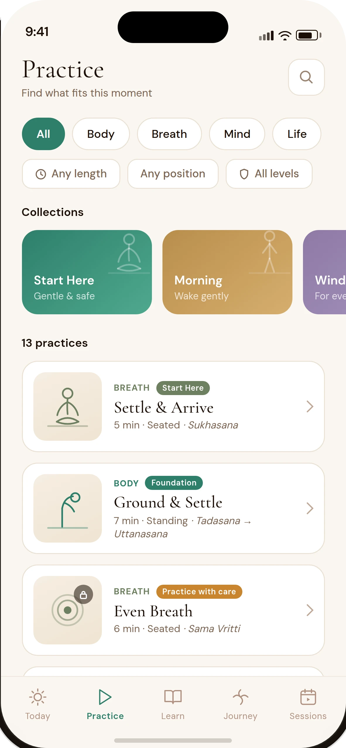
Practice: filters that match how you're arriving, not a genre list. - 02 / 03
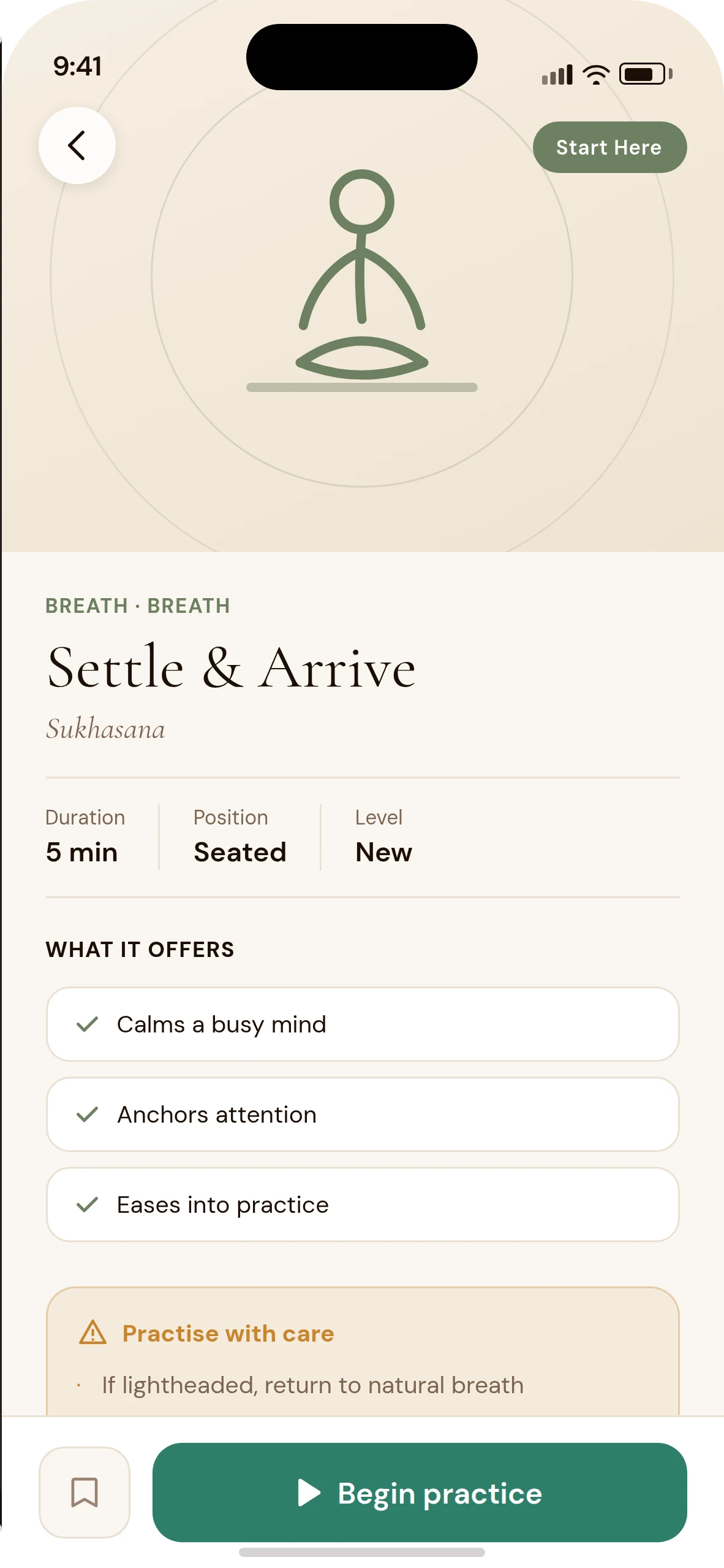
The detail screen is the instruction, not a teaser
Duration, position and level up top, then what the practice offers, and (for anything above "Start Here") a standing caution card before the button to begin. Nothing is hidden behind the player.
Detail: read it before you commit to it. - 03 / 03
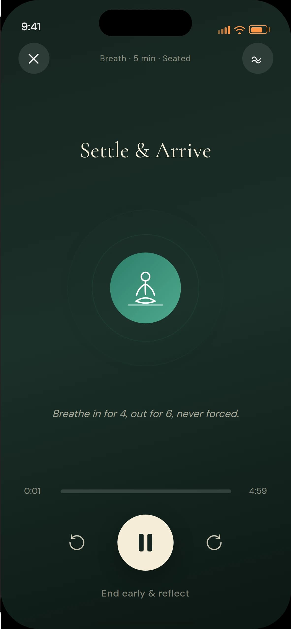
The player keeps the one line that matters on screen
A breath cue ("Breathe in for 4, out for 6, never forced") stays visible the whole time, with a simple countdown and a calm, low-contrast palette that doesn't compete with the practice itself.
Player: one instruction, not a dashboard.
Where the product held its nerve
- Decision 01
- Constraint
- A numeric streak is the easiest progress metric to build, and the first thing that makes someone feel like they've failed after missing a day.
- Decision
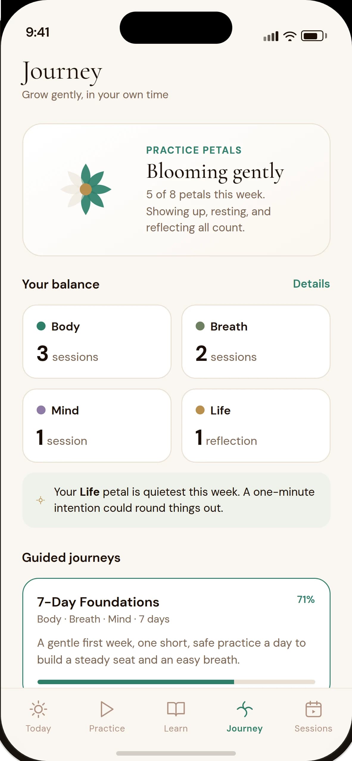
- Replace it with Practice Petals, a weekly flower that fills from any kind of engagement, a full practice, a short reset, or a reflection, with no counter that resets to zero.
- Result
- The Journey tab reads "5 of 8 petals this week. Showing up, resting, and reflecting all count" rather than a broken streak number.
Journey: a week's shape, not a chain to keep unbroken. - Decision 02
- Constraint
- Yoga and breathwork content that reads as generic wellness copy erodes trust the moment someone tries a practice that isn't right for them.
- Decision
- Give every practice a safety level and its own caution list, and put a standing "when to seek a professional" note on the detail screen rather than a one-time disclaimer at signup.
- Result
- Even a beginner-friendly practice like Settle & Arrive carries a specific caution ("If lightheaded, return to natural breath"), not a generic warning.
The caution is specific to the practice, not boilerplate. - Decision 03
- Constraint
- A teacher marketplace is a genuinely different product, two-sided, transactional, with its own trust problems, and building it halfway would have diluted the daily practice experience.
- Decision
- Design and build the whole thing, discovery, booking, payment, a teacher-side dashboard and payouts, but gate it behind one toggle explicitly labelled as a future release, off by default.
- Result
- The Profile screen's "Teacher Sessions" row reads "A future release. Toggle on to preview the teacher marketplace, it stays out of your daily navigation", exactly what it does.
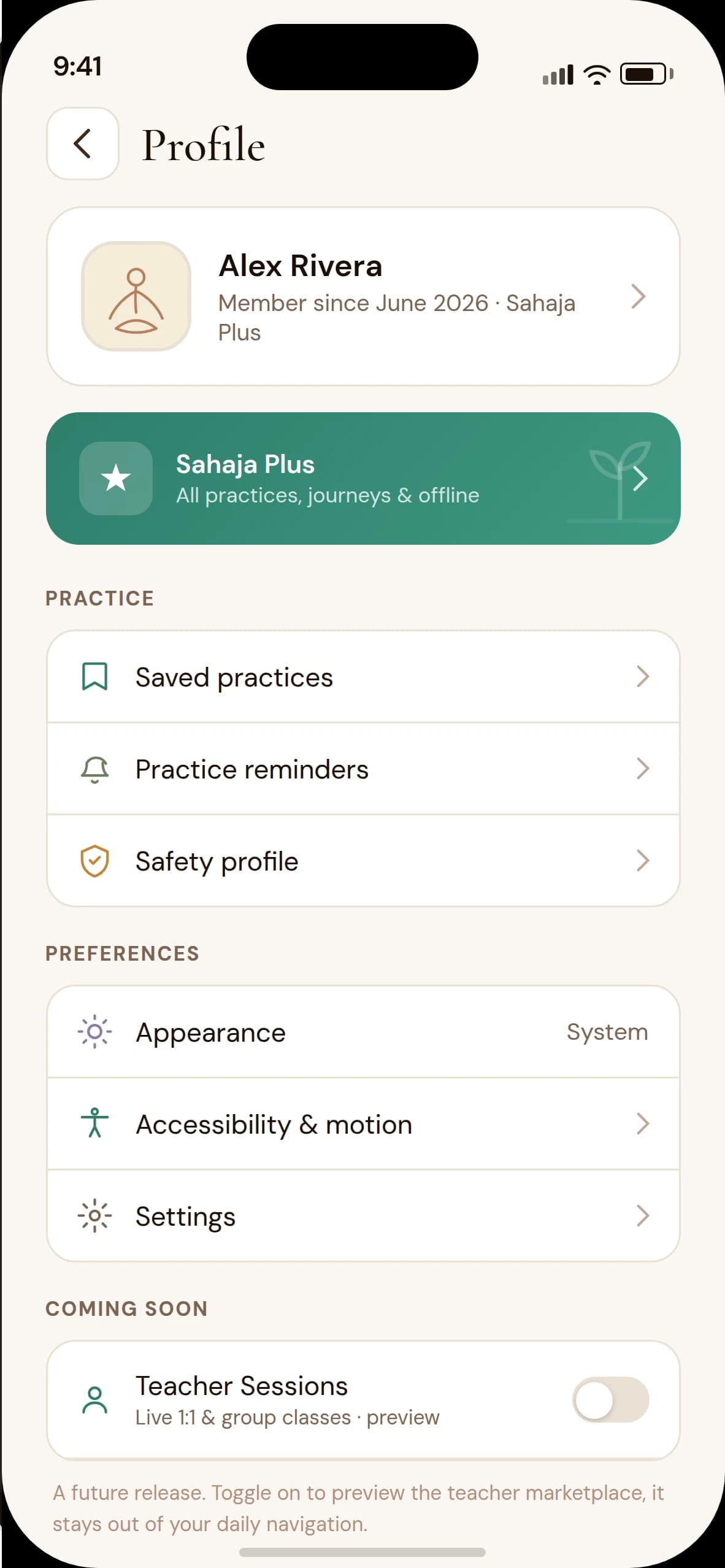
Profile: the preview feature, named as one, off by default.
A guided week, day by day
Guided journeys turn the same practice library into a short programme. 7-Day Foundations is a gentle first week. Each day opens onto a small set of practices rather than one long session.
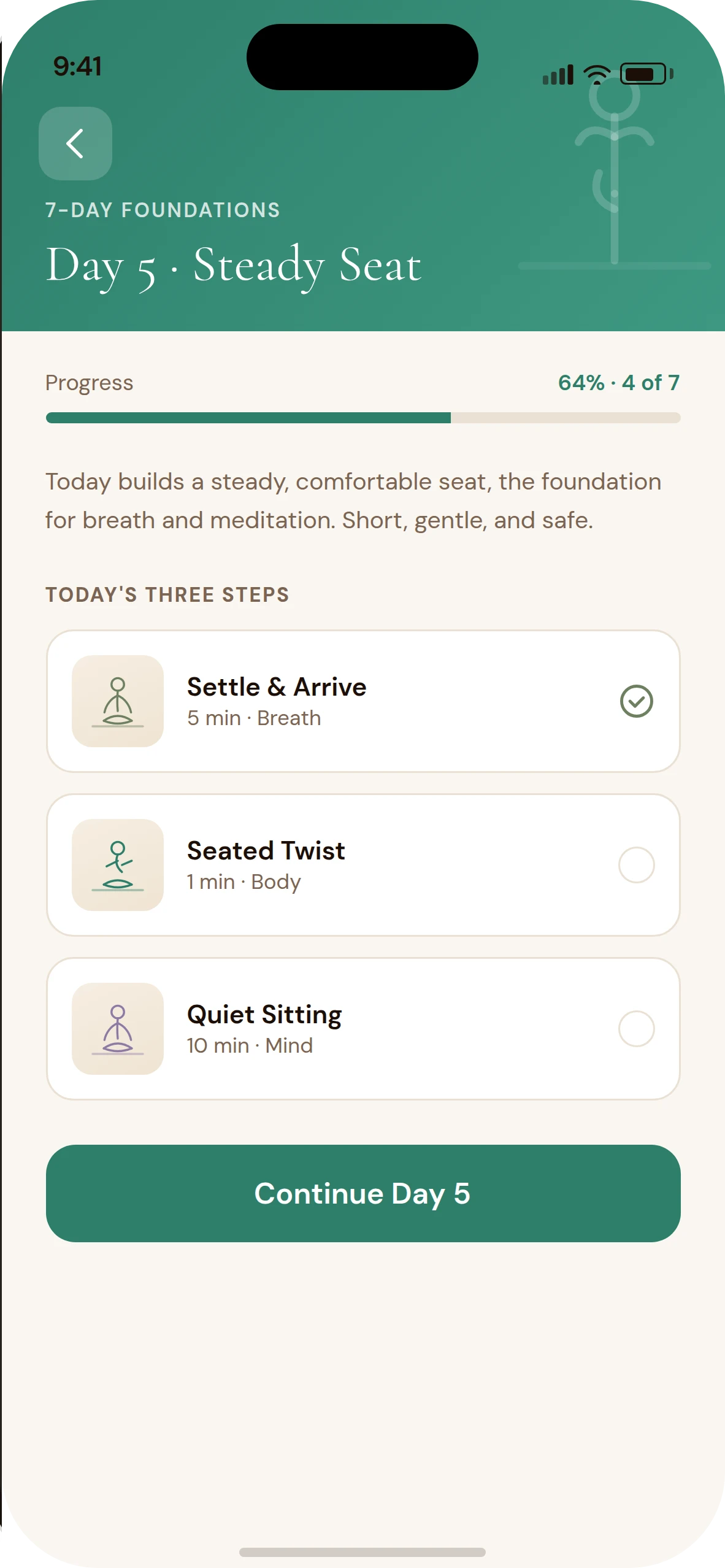
Day 5 of 7: three short practices, not one long class.
Warm, low-contrast, and drawn by hand
A cream and parchment palette keeps the interface calm, moss green marks progress and safety, and a muted amber carries cautions. Cormorant Garamond, often italic, gives headings and emotive copy warmth. DM Sans carries the interface. Every pose and concept has its own monoline figure icon, drawn once and reused everywhere, on cards, empty states, and as the fallback avatar when no photo is set.
- Moss: progress, safety#2E7F6B
- Cream: background#F5EDD8
- Ink: text#1C0F07
- Care: cautions#C9852F
- Mind: meditation content#8E7AA6
- Headings: Cormorant Garamond400–500 · often italic
- Interface: DM Sans400–700 · 11–16px
Try it
The real prototype on sample data, served as supplied with two changes only: React and ReactDOM are now loaded locally instead of from a CDN, and the demo profile's photo, name and email have been replaced with sample content (see the case study's source notes). Browse the library, open a practice, run the player, check Journey.
Loads on request. Nothing is embedded until you start it.
What it is, and what it isn't
Sahaja is a portfolio concept: a working practice library, player and journey system, with a fully designed marketplace kept off by default. It has no company, no backend and no real instructors behind it, so it's presented as exactly that: a concept to try, not a shipped or live product.
- 13 fully-written practices with real instruction, not placeholder copy
- A progress system designed to avoid streak pressure by construction
- A complete second product, the teacher marketplace, built but not switched on by default
Reflection
The teacher marketplace was the harder design call than any single screen in it: building the whole two-sided flow and then choosing not to surface it by default. It would have been easy to ship it prominently and let the daily practice experience compete with it for attention.
The smaller decision I'd point to instead is the caution list on every practice. It's not dramatic, but it's the difference between a wellness app that feels responsible and one that just feels calm.